FreelanceFlow.
Designing one trustworthy place for clients and freelancers to find each other, agree on work, collaborate and get paid.
FreelanceFlow is a two-sided freelance marketplace that covers the full hire-to-pay loop: posting a job, sending proposals, hiring, tracking time, invoicing and secure payment, with an admin panel that keeps the platform trustworthy.
- Services
- UX Research, Product Design, UI Design, Frontend Development
- Date
- 2025
- Type
- Capstone Project
- Stack
- React, Tailwind CSS, React Hook Form, Node.js

What I delivered
- 01Framed the problem around four pain points (trust, scattered communication, late payments and poor project visibility) and three role-based personas.
- 02Turned the requirements into a prioritised MVP: 10 must-have features scoped with MoSCoW and written as user stories with acceptance criteria, estimated at about 126 hours of build.
- 03Designed role-aware information architecture and four end-to-end user flows for freelancers, clients and admins, then took them through wireframes, a component system and high-fidelity UI to a React build.
- 04Tested the prototype with 5 participants: 84% task completion and a SUS score of 76 (above the 68 average), then turned all 9 findings into design changes.
Three roles, each with a primary persona. Aria, a freelance web developer, wants matching projects, simple proposals and to get paid on time without tracking hours in spreadsheets. Jordan, a small business owner, wants to post a job quickly, compare proposals and pay safely. Alex, the platform admin, needs to moderate accounts, resolve disputes and see platform health in one place.
End to end: problem framing, personas, requirements and MoSCoW prioritisation, user stories, information architecture, user flows, wireframes, the component system, high-fidelity UI and the frontend build in React.
The problem
Freelancers and the small businesses who hire them juggle job boards, email, spreadsheets and payment apps to get a single project done. The result is low trust, scattered communication, late payments and no clear view of progress, and existing platforms are often too complex, charge high fees or neglect accessibility. How might we give clients and freelancers one trustworthy, accessible place to find each other, agree on work, collaborate and get paid?

Business, design and technical goals
Ship a polished MVP that covers the full hire-to-pay loop for freelancers and clients, with an admin panel for platform integrity. Should-have and nice-to-have features give a clear path to iterate.
Clarity over complexity, trust by default and role-aware navigation, all responsive, consistent and designed to WCAG 2.1 AA.
React and Tailwind on the frontend with a Node.js and Express REST API, JWT role-based auth, MongoDB Atlas, Cloudinary for uploads and Stripe for escrow-style payments.
- React
- Tailwind CSS
- React Hook Form
- Node.js
- Express
- MongoDB Atlas
- JWT
- Stripe
- Cloudinary
- Socket.IO
- Navigation adapts to each role and is designed to WCAG 2.1 AA.
- Strong colour contrast and clear hierarchy across data-heavy dashboard views.
- Responsive layouts so every role can work on desktop or mobile.
- Consistent components and interaction patterns to reduce cognitive load.
From discovery to the final experience
Problem framing & personas
I started from the friction on both sides of a freelance project: unverified profiles and no protection if work isn't delivered or paid for, briefs and feedback scattered across email and chat, freelancers chasing invoices, and clients unable to see progress until the deadline. I captured these as four pain points and a single How Might We, then built a persona for each role (Aria the freelancer, Jordan the client and Alex the admin) with their goals and frustrations.
Requirements & prioritisation
I wrote a requirements document covering purpose, roles, content types, the data model and technical constraints, then prioritised features with MoSCoW. Ten must-haves form the hire-to-pay loop: profiles, posting projects, proposals, hiring, time logging, invoicing, Stripe payments and admin management. Messaging, reviews and search were scoped as should-haves, and analytics and AI-powered recommendations as nice-to-haves. Each must-have became a user story with acceptance criteria and an effort estimate, about 126 hours in total, and I logged the main risks: role-based permissions, secure auth and Stripe's setup requirements.
Information architecture & user flows
Because each role needs different things, navigation adapts to who is signed in: a public layer for browsing, a freelancer dashboard (find projects, proposals, projects, messages), a client dashboard (post a project, browse freelancers, payments and invoices) and an admin panel. I mapped four end-to-end flows (freelancer find-work-to-get-paid, client post-hire-pay, admin moderation and authentication), each with its decision points, such as a rejected proposal returning the freelancer to Browse Jobs.
Wireframes & component system
Low-fidelity wireframes set the layout for the landing page, project listings, profiles and card-based dashboards before any visual design. I then built a component system in Figma (inputs, a multi-step stepper, skill tags, stat cards and avatars) so every screen shared the same patterns and the build could reuse them directly.
High-fidelity design & build
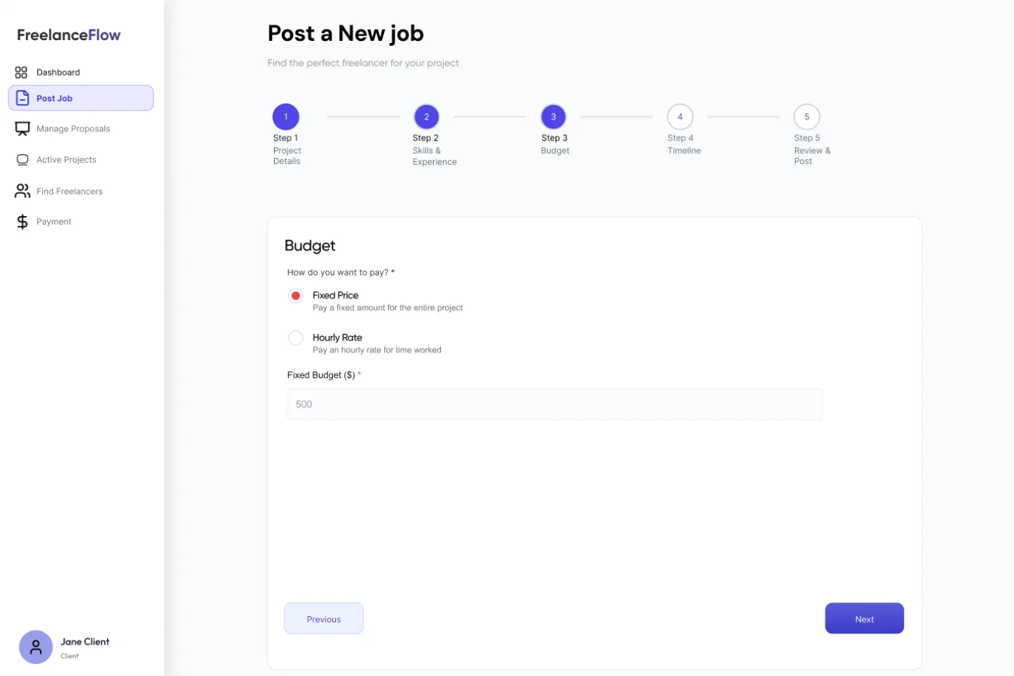
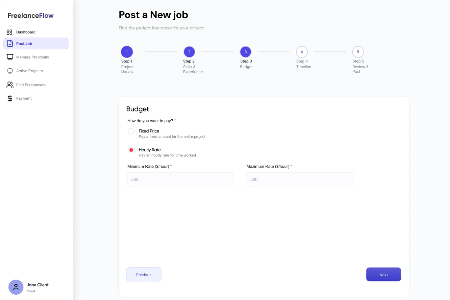
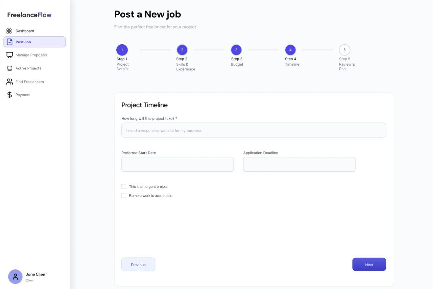
The high-fidelity screens cover onboarding with a freelancer-or-client role choice at sign-up, browsing and filtering jobs, applying to a job, the client dashboard, and a five-step Post a Job wizard that breaks a long form into manageable steps. I built the frontend in React and Tailwind, mapping the Figma components to reusable React components.

Usability testing & iteration
I ran moderated, task-based sessions on the prototype with five participants across both sides of the marketplace, covering the core hire-to-pay tasks. Posting a job was the clear problem: participants weren't sure whether the budget was fixed or hourly, and two abandoned at that step. Every finding became a design change, set out in the testing section below.
Usability testing
- Goal
- Validate that freelancers and clients can complete the core hire-to-pay tasks without help, and find where they hesitate.
- Method
- Moderated remote sessions on Zoom with the Figma prototype, think-aloud, about 30 minutes each, followed by a System Usability Scale (SUS) questionnaire.
- Participants
- 5 participants: 3 freelancers (development and design) and 2 small-business clients, with mixed comfort with technology, aged 22 to 45.
- Success criteria
- At least 80% task completion, a SUS score of 68 or above (the industry average), and no critical issues left unaddressed.
5
participants across both sides of the marketplace
84%
average task completion across 5 tasks
76
SUS score, grade B (“good”)
9
findings, each turned into a design change
- T1 Sign up & build a profile · 2m 30s avg100%
- T2 Find a job & submit a proposal · 2m 50s avg80%
- T3 Post a job · 4m 10s avg vs 3m target60%
- T4 Review proposals & hire · 1m 50s avg100%
- T5 Pay an invoice · 1m 05s avg80%
White tick marks the 80% target. Amber marks tasks below it.
Next roundRe-test posting a job (T3) and sign-up (T1) with 3 new participants after these changes, targeting at least 90% task success and a SUS score of 80.
From wireframe to final, and why
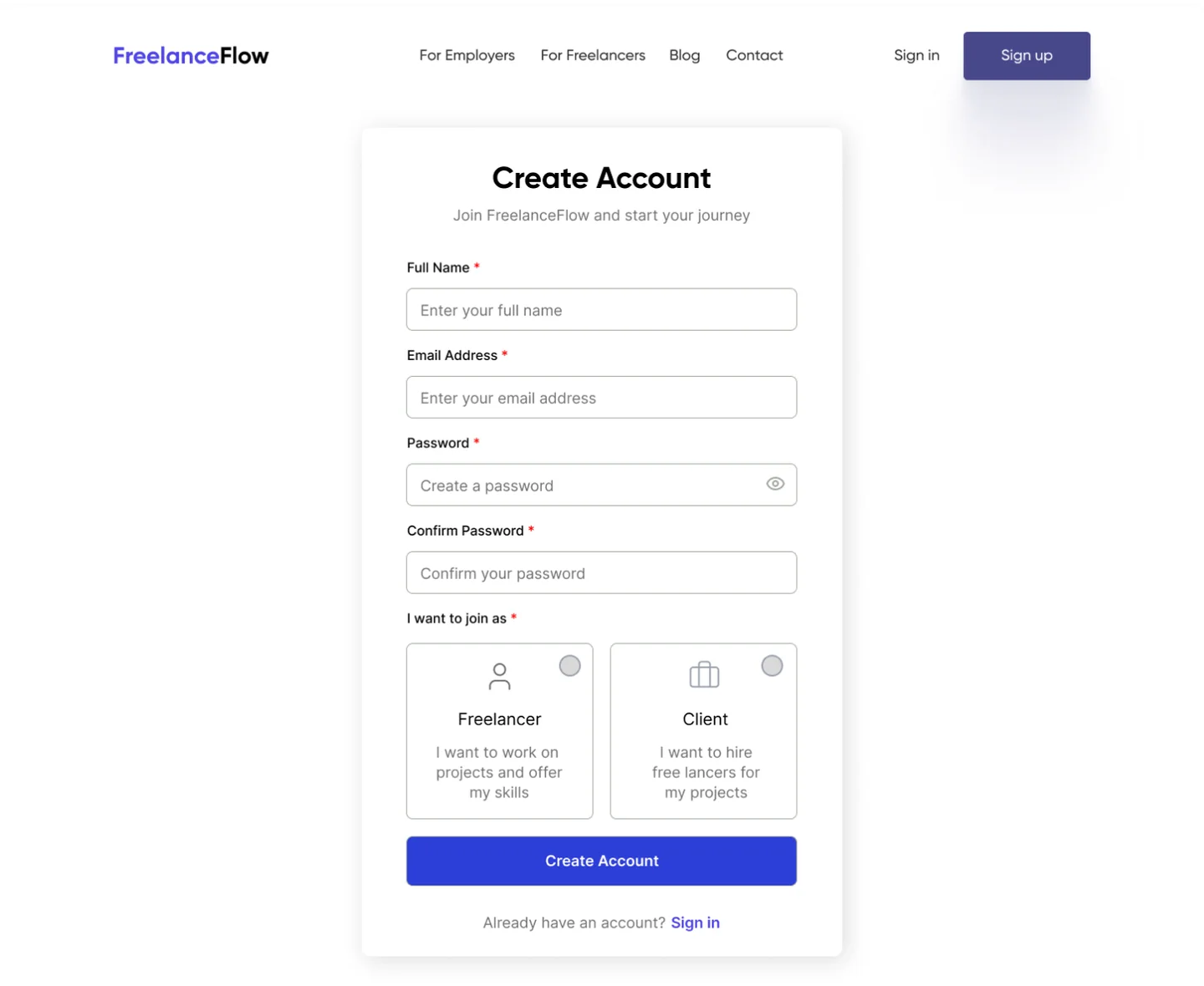
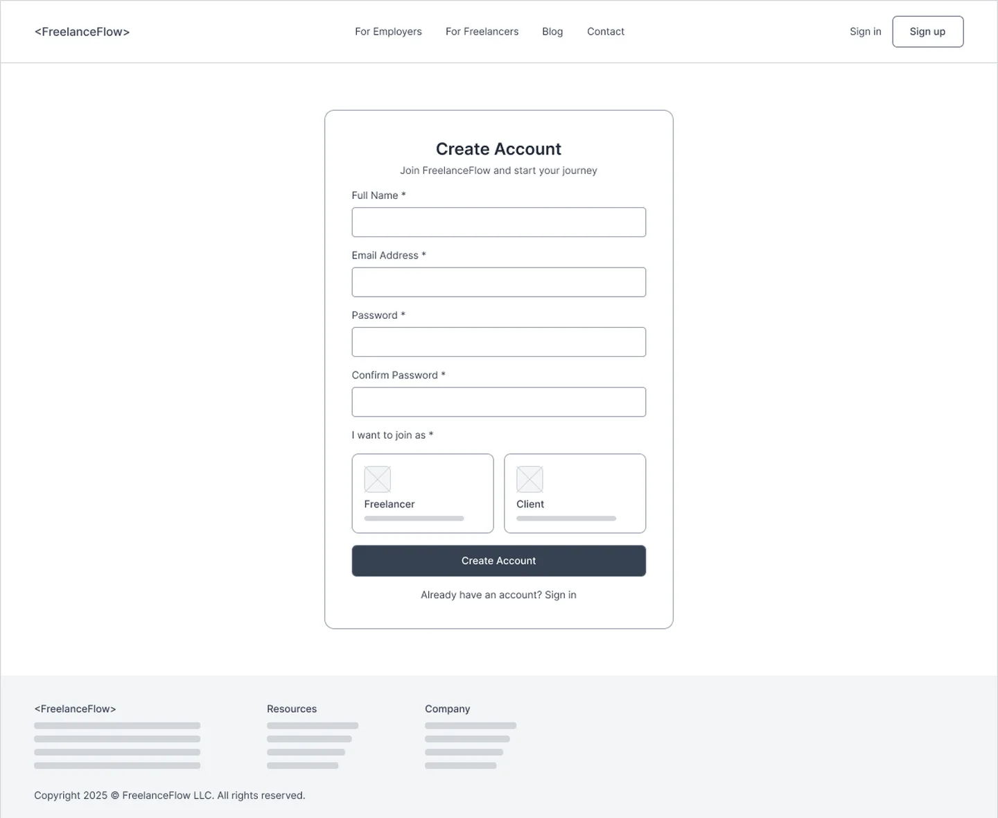 WireframeFinal
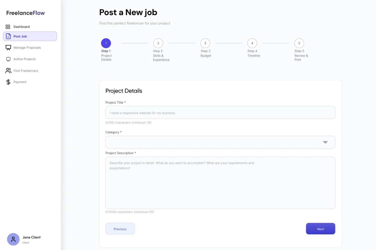
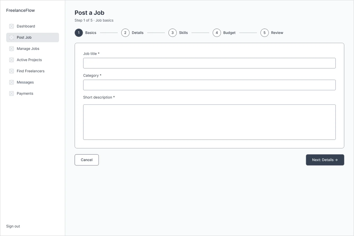 WireframeFinal
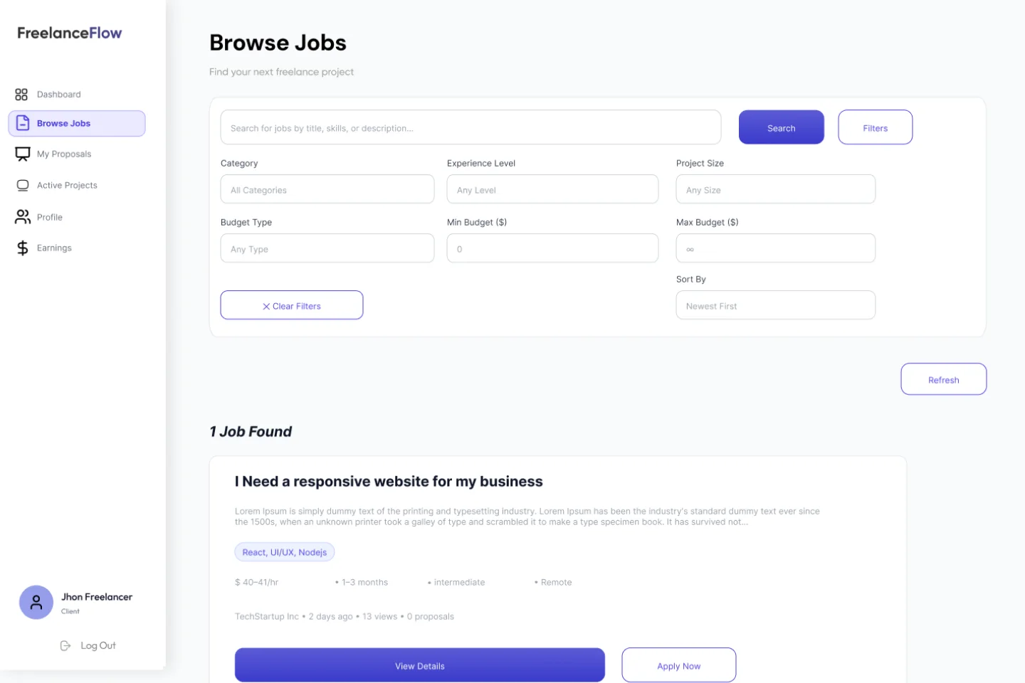
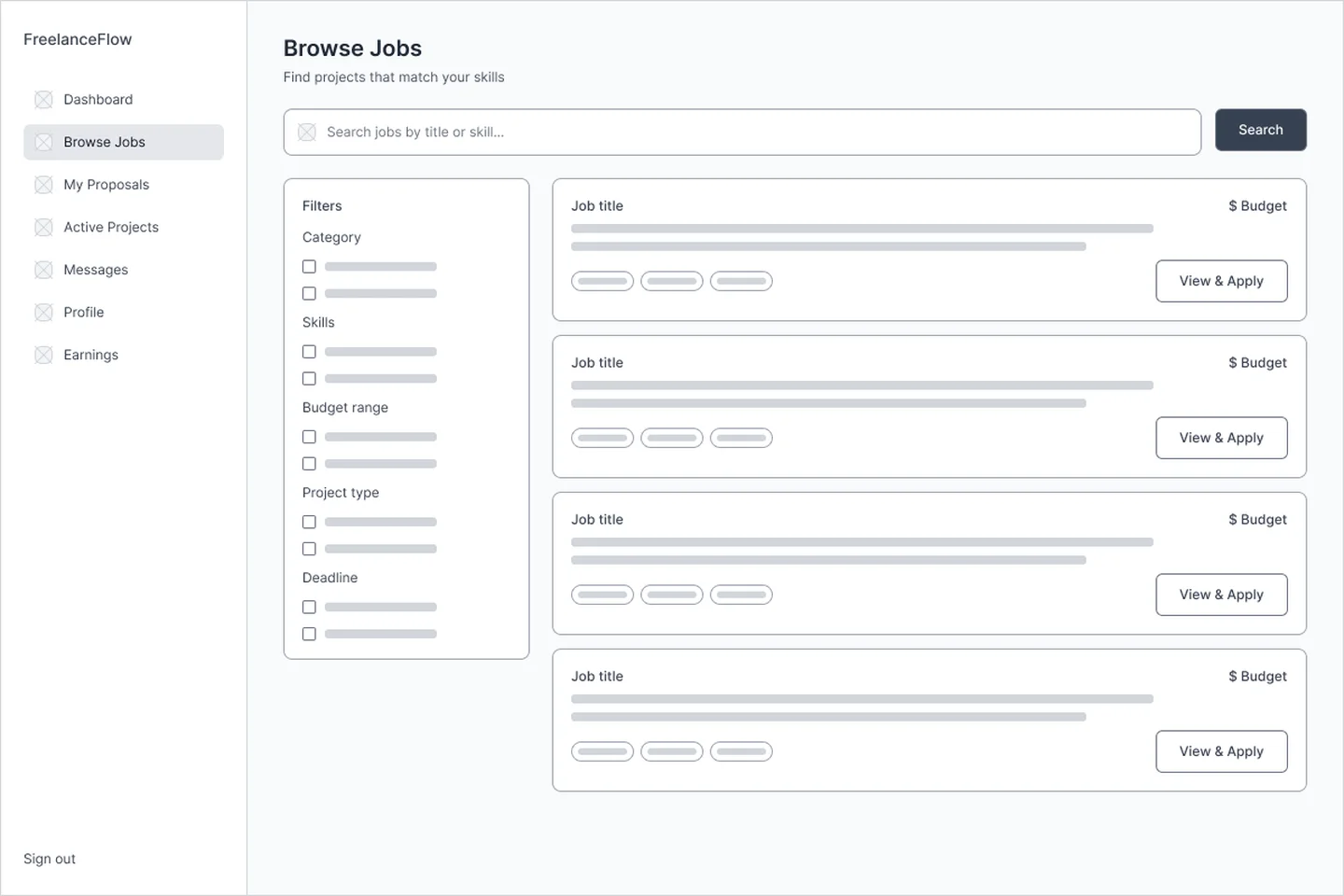 WireframeFinal
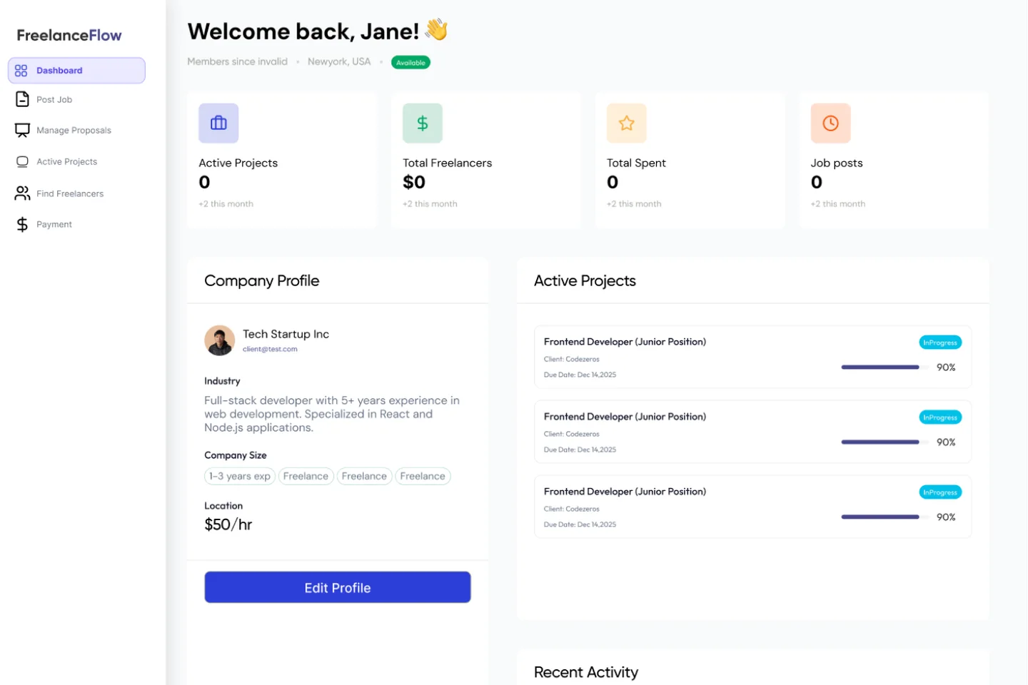
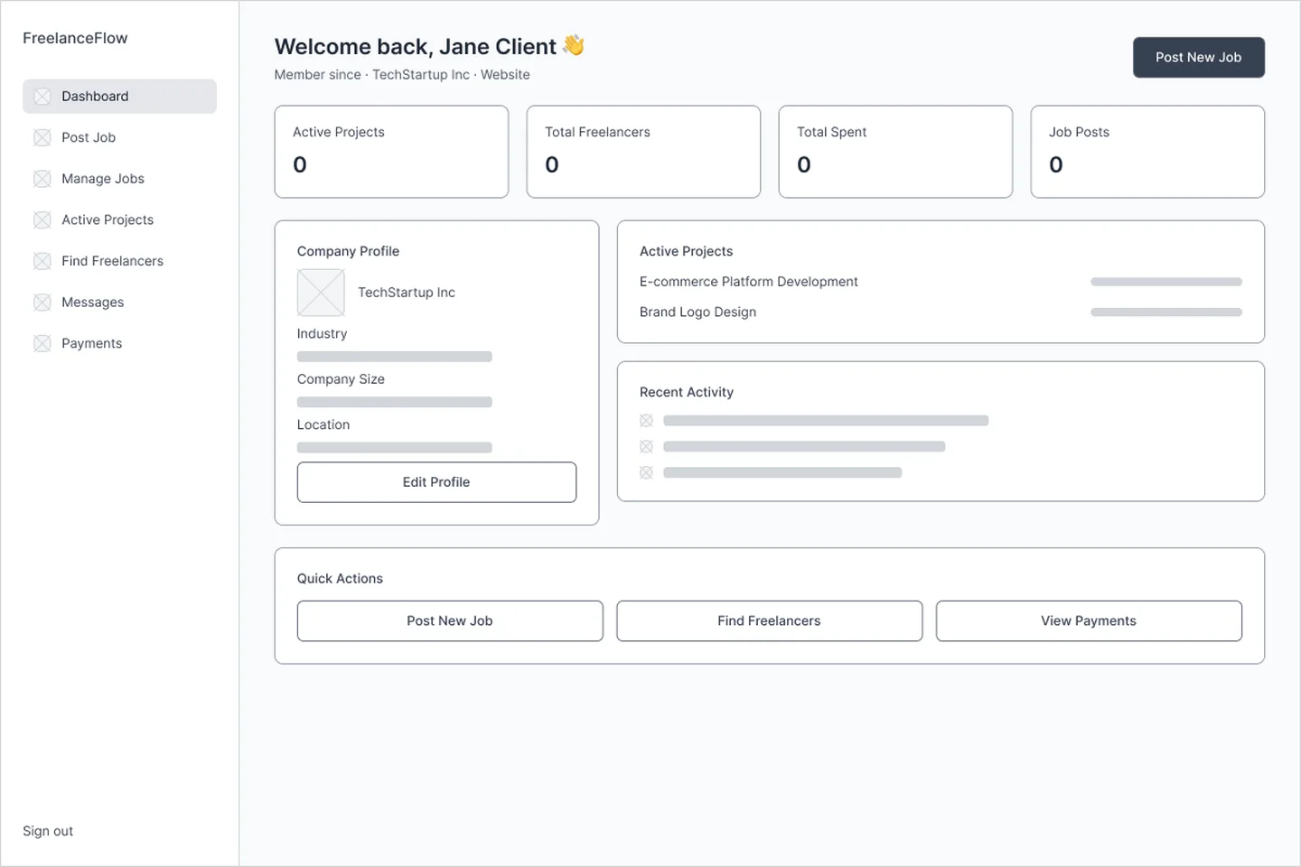 WireframeFinal
All 9 test findings · select one
- Evidence
3 of 5 hesitated; 2 abandoned at step 4
Design changeSegmented control with helper copy and example totals
Budget type (fixed vs hourly) unclear in Post a Job
01 / 093 of 5 hesitated; 2 abandoned at step 4
Segmented control with helper copy and example totals
Explore the flows
A five-step wizard turns a long form into manageable decisions: details, skills, budget, timeline, then review.
Final interface


What this project reinforced
- 01In a two-sided marketplace, trust is the product: verified profiles, escrow-style payment and visible progress matter as much as any single screen.
- 02Prioritising with MoSCoW kept the MVP focused on one complete hire-to-pay loop instead of many half-finished features.
- 03Role-aware navigation let three very different users share one product without any of them seeing clutter meant for someone else.
- 04Small decisions carry big weight: one unclear choice, a fixed or hourly budget, caused both abandoned attempts at posting a job.
- 05Owning both the design and the build meant the component system in Figma and in React stayed the same system.
Giftelle.