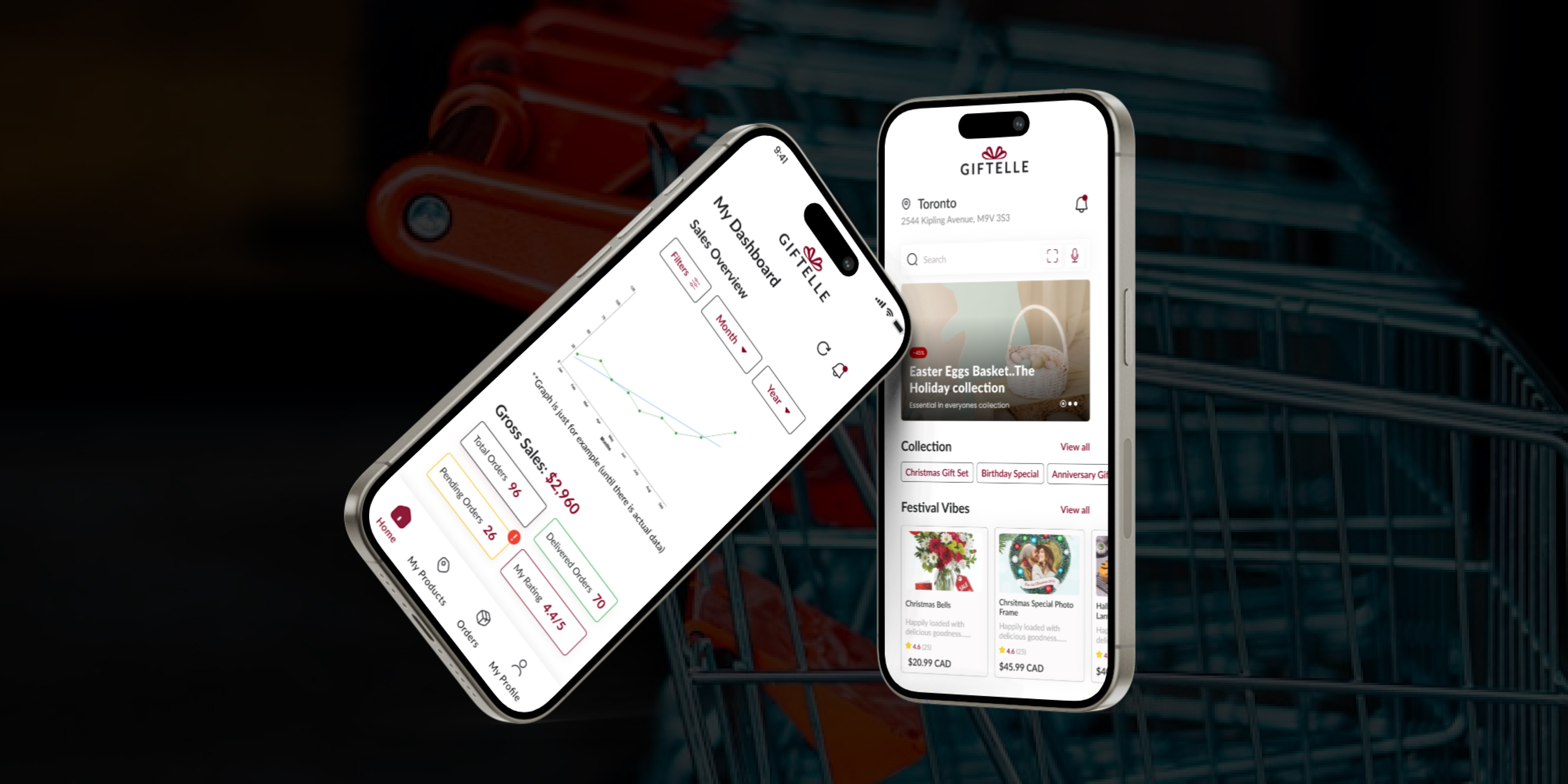
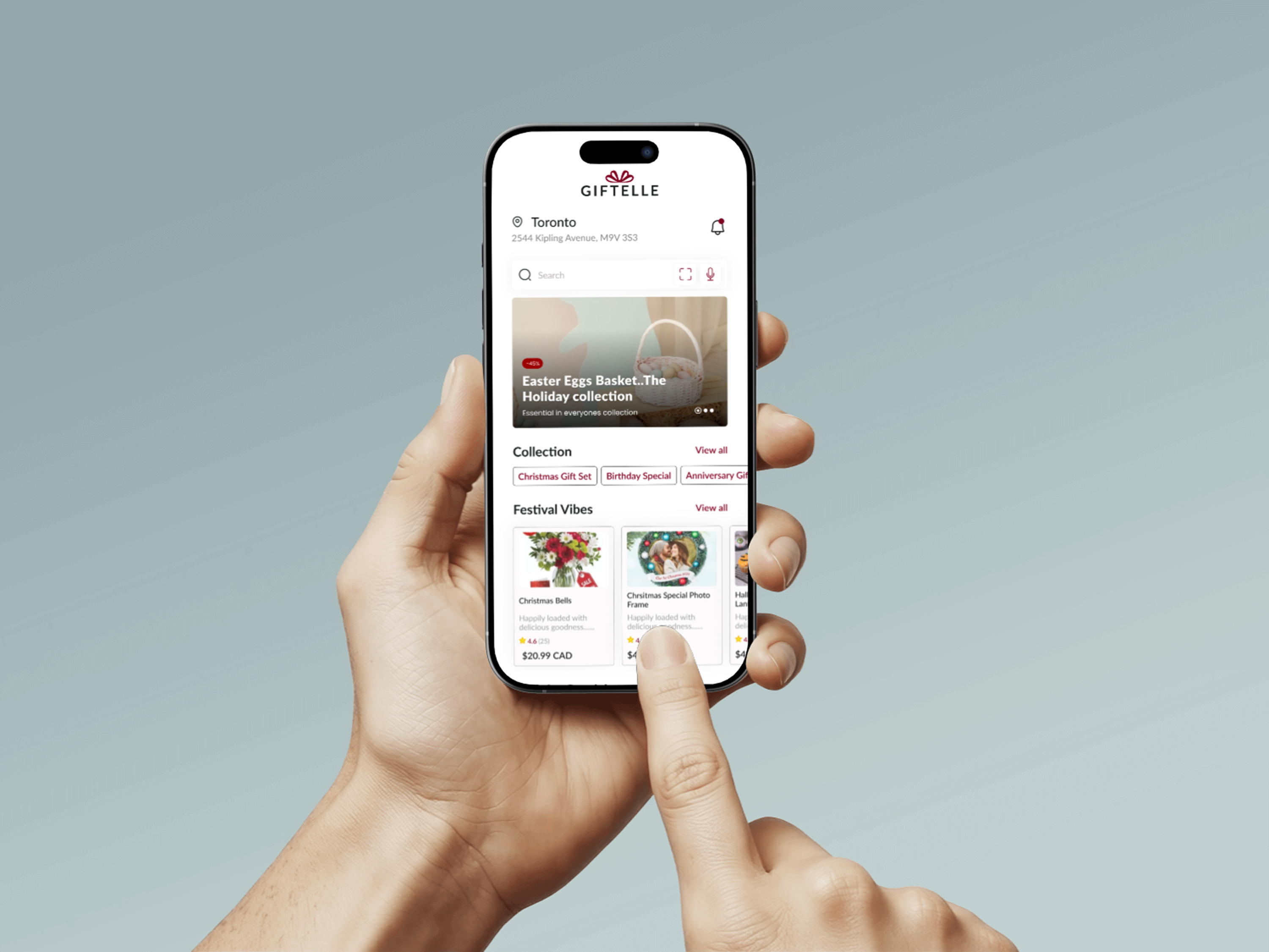
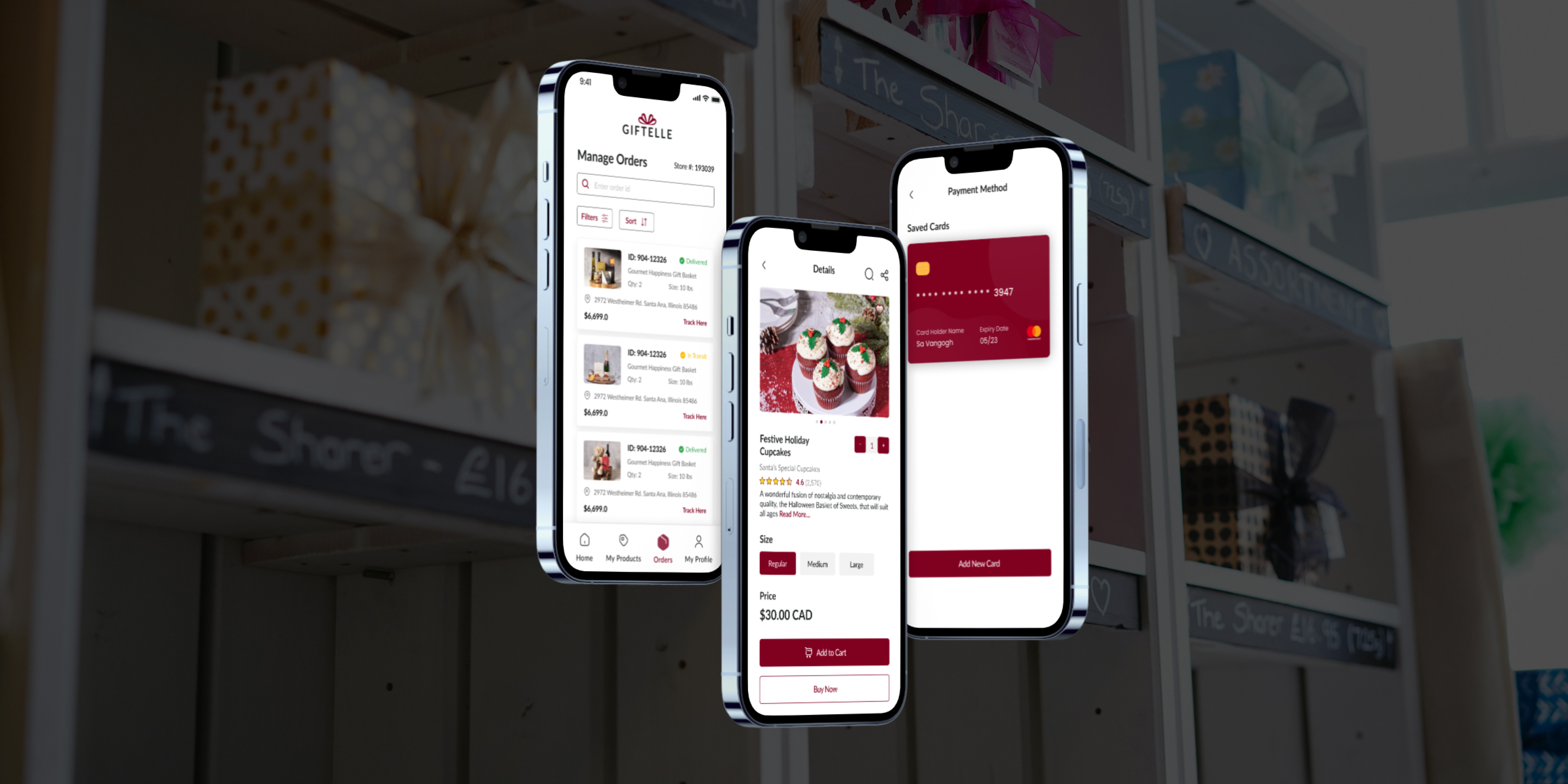
Giftelle: Personalized Gifting, Simplified.

A frictionless gift discovery platform designed to reduce decision fatigue and increase thoughtfulness.

Hero

Services

UX Strategy, UI Design, Visual Branding, Research

Date

Sept 2024

Agency

HRXConnect


Target Audience

Busy individuals who value meaningful gifts but lack the time or energy to browse endless online options.

The Problem

Users often face decision fatigue when trying to choose thoughtful gifts online. Between large catalogs, generic recommendations, and a lack of personalization, they end up buying late, with low confidence in their purchase.

My Role

I led the UX efforts across research, wireframing, UI design, and developer handoff. Working closely with stakeholders at HRXConnect, I focused on building a personalized user experience that felt intentional, calm, and empowering.

Client

HRXConnect

HRXConnect

Clear Project Goals

  • Business: Increase engagement and sales by offering curated, high-intent gift suggestions through a streamlined shopping experience.
  • Design: Craft a calm, emotional interface that minimizes friction, prioritizes personalization, and reinforces a premium brand identity.
  • Technical: Ensure scalable architecture for the gift quiz logic, enable clean analytics capture, and maintain performance across devices.

Tech Stack

Figma (Design & Prototyping)React + Tailwind CSS (Frontend)Node.js + Express (Backend)MongoDB (Database)Render & Netlify (Deployment)

Accessibility Considerations

  • ✅ WCAG AA color contrast maintained across text and backgrounds.
  • ✅ Keyboard navigation supported throughout interactive flows.
  • ✅ Descriptive alt text applied to all product and decorative imagery.
  • ✅ Form fields labeled and tested with screen readers for clarity.

Design & Development Process

Step 1: Discovery & Research

I conducted 50+ user surveys and 10 interviews to uncover pain points in the gifting process. Most users described gifting as 'overwhelming' and 'time-consuming.' From this, I created two key personas: the Thoughtful Planner and the Last-Minute Giver. I also audited competitors like Etsy, Amazon Gifts, and UrbanStems to identify UX gaps such as excessive filtering, impersonal recommendations, and cluttered visual design.

Step 2: Strategy & User Flows

We defined a product vision that centered on curated personalization. I created journey maps to highlight where users experience cognitive load or emotional drop-off. Key UX strategies included a gift-finding quiz, simplified categorization, and a browsing experience that emphasized inspiration over filters. I also created low-fidelity wireframes to validate flows before design execution.

Step 3: UI System & Prototyping

Inspired by premium DTC brands, I designed a visual system with soft neutral tones, serif fonts, and generous white space to reduce cognitive load. I prototyped flows in Figma and tested with users using clickable prototypes. Key feedback: users wanted to complete the quiz quickly and receive fewer, but better-matched results. I adjusted visual hierarchy, CTA placement, and copy to support this feedback.

Step 4: Developer Handoff & Collaboration

I built a scalable design system in Figma and delivered pixel-perfect specs with clear component rules. I worked alongside the dev team to ensure accessibility best practices (color contrast, focus states) and responsive design across breakpoints. Final testing included edge case behavior for quiz logic and browsing experience.

Step 5: Launch Planning & Post-Validation

I helped the team plan the launch, prepare onboarding messaging, and set up analytics for key flows like quiz completion and product clickthrough. Post-launch, we gathered early behavior data and positive qualitative feedback, especially around the clarity of the UI and the personalization experience.

Launch Planning & Post-Validation

Final Results

Final Image 1Final Image 2Final Image 3

Key Takeaways

  • 🎯 Personalization Drives Engagement: Users who completed the quiz were 2.3x more likely to continue browsing and select a product compared to users dropped into a general catalog.
  • 💡 Hierarchy and Emotion Matter: Clear, calming UI dramatically reduced bounce rate in testing and improved quiz completion from 61% to 88% after iteration.
  • 🔄 Fast Feedback Loops Prevent Waste: Early prototyping allowed me to identify usability issues in quiz logic, layout, and navigation—saving significant dev time.

Let’s Work Together

Have a project in mind? Let's bring it to life.