Case Study

Designing a lightweight UI system to improve speed, consistency, and developer handoff.

Basics UI is a minimal design system built to help designers and developers prototype faster while maintaining accessibility, visual consistency, and implementation clarity.

Design SystemsUI DesignAccessibilityDeveloper ExperienceJune 2024Self-Initiated Project
Designing a lightweight UI system to improve speed, consistency, and developer handoff.

Created a reusable foundation for faster MVP design and product exploration.

Improved consistency across interface patterns through a lean token-based system.

Reduced design-to-development friction with clearer component logic and documentation.

Services

Design Systems · UI Design · Accessibility · Developer Experience

Date

June 2024

Agency

Self-Initiated Project

Client

Basics UI

Audience

Who this experience was built for

Freelance designers, frontend developers, and lean product teams working on MVPs, internal tools, and early-stage products that need speed, flexibility, and consistency.

Role

My contribution

This was a self-initiated end-to-end systems design project. I defined the design system strategy, planned the component architecture, created the token structure, designed and tested reusable patterns, and refined the system through feedback from designers and developers.

Challenge

The problem behind the experience

Many UI kits are either too opinionated, visually heavy, or difficult to adapt as product needs evolve. For teams trying to move quickly, this creates unnecessary friction: systems become bloated, customization slows momentum, and accessibility is often treated as an afterthought instead of a core design principle.

Context

Basics UI

This project centered on translating user needs and product goals into a cleaner, more thoughtful digital experience.

Basics UI

Goals

Aligning business, design, and technical outcomes

Business

Create a lightweight and adaptable UI foundation that helps teams prototype faster and scale more consistently across product ideas.

Design

Build a clean, minimal, and accessible system that supports visual consistency without forcing a rigid visual style.

Technical

Establish reusable tokens, component behavior, and documentation that make implementation faster and easier for developers.

Tech Stack

Figma · Design Tokens · Auto Layout · Variants · Component Documentation · Responsive States

Accessibility

  • Built accessible color contrast and interaction states into the system from the start.
  • Considered focus visibility and keyboard interaction across foundational components.
  • Used clear spacing, typography, and hierarchy to improve readability and scanability.
  • Designed the system to support both light and dark themes without compromising usability.

Process

From discovery to a refined final experience

A structured process focused on clarifying user needs, reducing friction, and translating strategic thinking into polished interface decisions.

Step 1

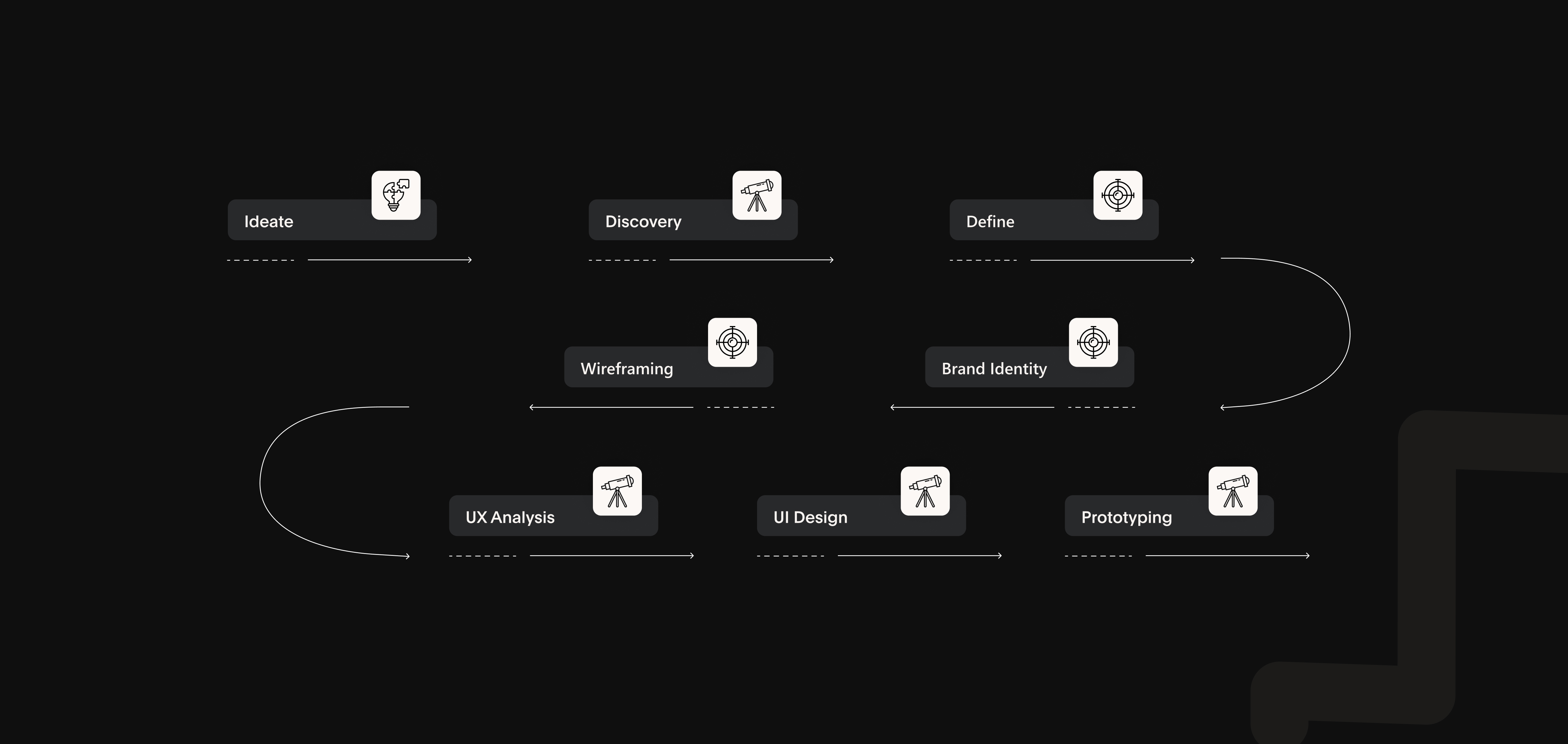
Research & Opportunity Mapping

I reviewed systems such as Tailwind UI, Radix Primitives, and Chakra UI to understand where current tools were effective and where they introduced friction. While many were powerful, they often required heavy setup or imposed stylistic defaults that reduced flexibility. I also spoke with freelance designers and frontend developers to understand what slows them down when moving from concept to usable interface.

Step 2

System Planning & Token Architecture

I defined a lean component system focused on high-utility building blocks including buttons, inputs, dropdowns, tabs, modals, and foundational primitives. I paired these components with a token structure covering spacing, typography, color, radius, and state behavior so the system could remain minimal while still supporting scale and adaptability.

Step 3

UI Design & Validation

I designed the component set in Figma using Auto Layout, variants, and reusable patterns to support flexibility and speed. Components were tested across light and dark themes, with close attention to interaction states, spacing rhythm, and readability. I shared early versions with developer peers to evaluate naming clarity, implementation logic, and handoff efficiency.

Step 4

Iteration Through Feedback

After sharing the system with a small group of freelance designers and React developers, I refined spacing helpers, responsive behavior, and documentation clarity. This helped improve usability and adoption without unnecessarily expanding scope, resulting in a more focused system that supported both product exploration and smoother implementation.

Iteration Through Feedback

Outcome

Final interface and visual direction

Final result 1
Final result 2
Final result 3

Reflection

What this project reinforced

  • Design tokens created a scalable foundation that made it easier to maintain consistency and support future expansion.
  • Accessibility was more effective when treated as a system-level design decision instead of a final QA checklist.
  • Feedback from both designers and developers helped keep the system practical, lean, and implementation-friendly.
  • This project reinforced how strong systems thinking can improve both user experience quality and team efficiency.

Let’s Connect

Let’s build something thoughtful, scalable, and visually sharp.

I’m open to product design, UI/UX, and frontend opportunities — from collaborative team roles to meaningful freelance projects.

Email Directly

Based in

Toronto, ON

Open to

Full-time · Contract · Freelance